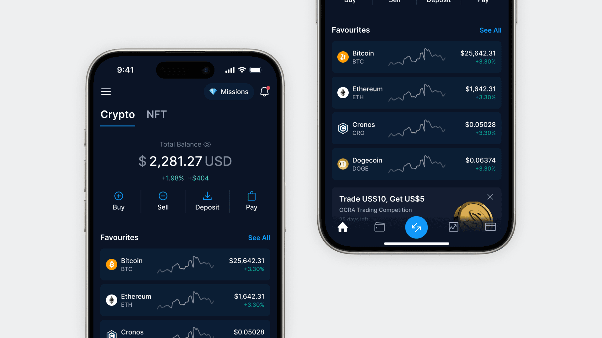
Crypto.com App Design System

Overview
The Crypto.com app requires a systematic approach for managing UI design at scale, ensuring consistency, accessibility, and efficient delivery. My goal as the Design System Lead is to establish a foundational UI library that stays synchronized across design and development teams.
As the primary design contributor, I crafted the design system from the ground up, covering everything from colors and typography to individual components. To ensure a seamless implementation, I formed a collaborative workgroup, bringing together platform engineers from both the iOS and Android teams. Together, we successfully implemented the UI library and created a reference application.
Approach
A shared artefact: The UI library is a shared piece of work that requires constant input from designers and engineers.
Prioritise with impact: Most used elements are being shipped first. The UI library evolves with the product, feature-by-feature.
Modular Components: Developed an atomic design system with reusable components, prioritizing flexibility and consistency in UI elements.
Constantly Improving: Established a feedback loop for continuous testing and iterative design updates based on user and team feedback.
Outcomes
- Figma components insert grew significantly from average ~100 to ~5k per week
- Positive feedback from engineering teams across platforms
- Improved development velocity, design consistency and accessibility with the use of new color tokens and components
Gallery


